Sunday · Branded merchandise platform · 2026
Sunday's B2B app, designed around how the work flows.
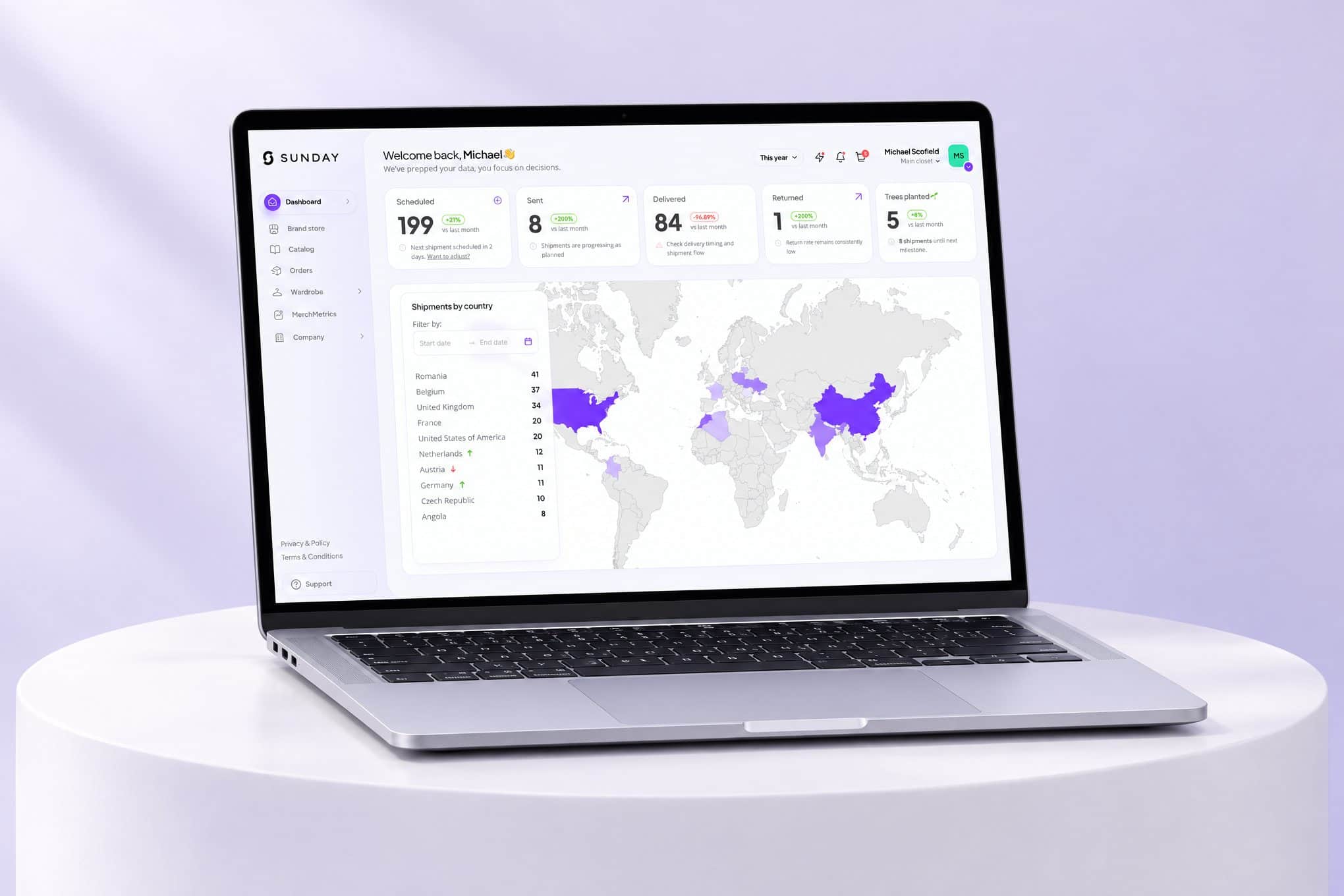
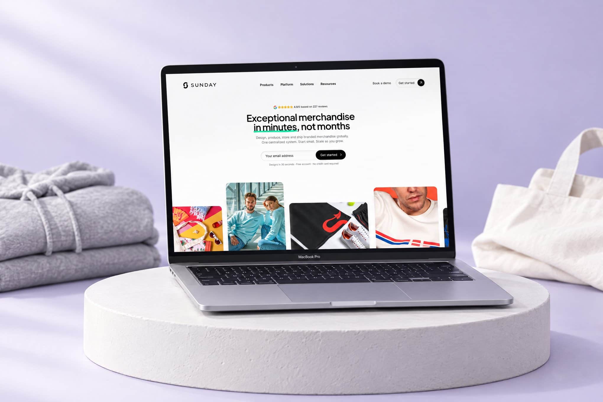
For Sunday, a platform where companies design, produce, store and ship branded merchandise to 200+ countries, we analyzed the flows and processes behind its B2B application and designed the UX and UI on top of them. The application is where business customers run their merchandise programs. Our scope was analysis and design, not implementation.

By Mircea Muraru ·
Context
One application, many kinds of work.
Sunday's business customers do more than place orders. They keep merchandise in stock, send it to people, run gifting and recognition programs and follow what happens after delivery. The B2B application is where that work comes together.
Several groups of people use it: the teams that run merchandise inside a company, the people who receive it, partners who manage it for several companies, and the Sunday team that supports every account.
Challenge
Many paths, one coherent product.
When an application has to carry this many tasks, the risk is a screen for every request and no clear path between them. Each flow has to make sense on its own and still feel like part of the same product.
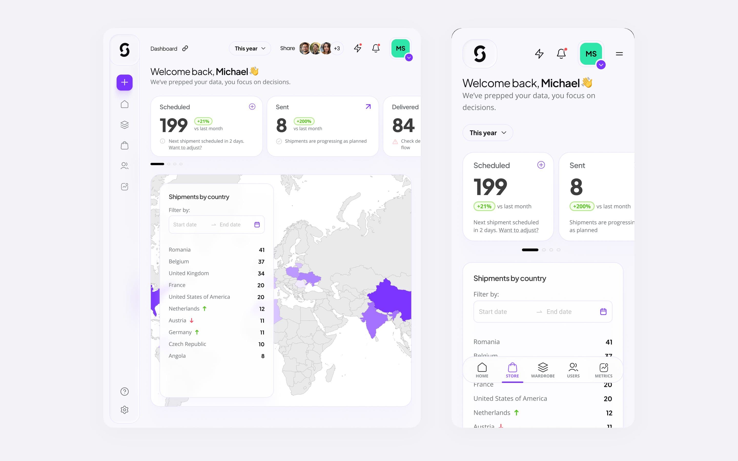
It also has to work for people who use it every day and for people who see it once, on desktop, tablet and phone.
What we did
Process first. Then UX. Then UI.
We started with the flows and processes: who does what, in which order, and where a task passes from one person to another. Mapping them before drawing screens meant every screen had a reason to exist.
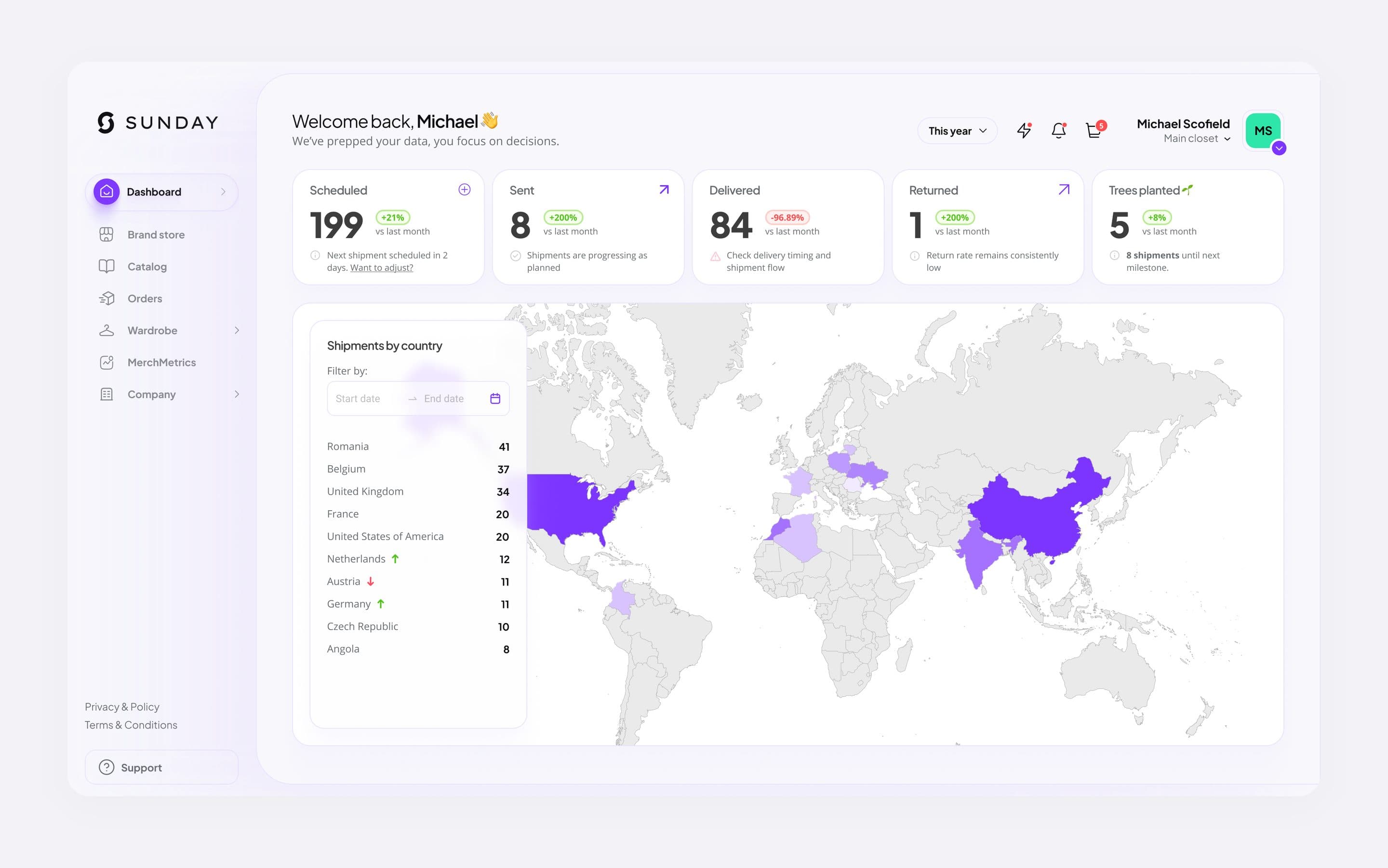
From there we designed the user experience, the structure and navigation of the application, and then the interface: a calm, consistent visual language, a shared set of components and layouts for desktop, tablet and mobile. The work lives in Figma, organized by product area, with prototypes of the key flows.
Outcome
A complete design, grounded in process.
Sunday received the process analysis and a complete UX and UI design for the application, covering every product area from sign-up to reporting.
Implementation was not part of our scope, and usage figures are Sunday's to share. We describe the work at a high level on purpose: the details of how Sunday operates belong to Sunday.
The design
The design, up close.
Questions about this project
Where did our part start, and where did it stop?
We analyzed the flows and processes the application has to support, then designed its user experience and user interface for desktop, tablet and mobile. Implementation was not part of our scope.
Why start with processes instead of screens?
Because screens follow work. When the flows are clear first, each screen has one job and the path between screens follows the way people actually work. Designing screens first tends to reproduce whatever confusion already exists.
Why does this case study stay at a high level?
The application is a working tool for Sunday and its customers, and the details of their processes belong to Sunday. We describe the approach and the kind of result, not the inner workings. Usage and results are Sunday's to publish.
Service
Where this work belongs.
More case studies
Keep reading.
Does your process need a clear shape first?
Tell us where the work gets tangled. We will say plainly how we would map it and whether we are the right partner.